Practising Data & Stats Skills - Coloured Peppers
.jpg)
This activity allows you to practice your data and statistics skills by graphing and analysing some data on the vitamin C levels in different coloured peppers.
This activity is a classic biology experiment and would not serve as an ESS IA. It has been designed to allow students to practise skills.
An ESS IA needs an environmental context, so you could compare vitamin levels in food produced in different agricultural systems, as an example.
Fresh peppers are an excellent source of vitamin C. A student decided to study the difference in vitamin C found in different colored peppers (Capsicum annuum L.), namely red peppers (Mesut), orange peppers (E22M-0343), yellow peppers (Surtsey), green peppers (Cheongyang), and purple peppers (Deu Syeo Bo Ra F1). Vitamin C was measured in mg/g.
Let's look at some data that could have come from this study[1].
NOTE: This data was constructed to allow you to do certain data manipulations and statistical tests. It does not necessarily reflect real life.
| Vitamin C Concentration (mg/g) | |||||
| Pepper # | Red | Orange | Yellow | Green | Purple |
| 1 | 29.1 | 29.7 | 31.2 | 31.2 | 24.9 |
| 2 | 27.9 | 30.1 | 30.8 | 30.1 | 25.1 |
| 3 | 29.3 | 29.8 | 32.5 | 28.7 | 24.8 |
| 4 | 28.1 | 30.2 | 29.9 | 31.5 | 25.2 |
| 5 | 28.7 | 28.9 | 31.4 | 30.9 | 25.8 |
| 6 | 29.2 | 30.0 | 29.7 | 31.1 | 26.1 |
| 7 | 28.9 | 29.8 | 27.5 | 28.7 | 25.6 |
| 8 | 27.9 | 28.4 | 29.4 | 32.4 | 25.7 |
| 9 | 29.3 | 29.1 | 30.5 | 31.9 | 26.0 |
| 10 | 28.9 | 30.2 | 32.1 | 32.5 | 25.6 |
| 11 | 29.3 | 29.8 | 28.9 | 31.9 | 25.9 |
| 12 | 29.7 | 31.3 | 26.9 | 30.9 | 26.1 |
NOTE: This data may also be accessed in this SPREADSHEET.
1. To begin to understand what the data reveals in relation to the research question, draw an appropriate graph of the raw data. NOTE: This graph wouldn't appear in an IA but rather helps you begin to understand your data.
2. Explain what your graph reveals about the raw data.
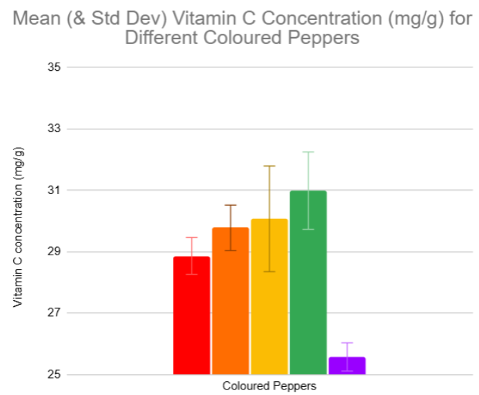
5. Describe how you would proceed from here to analyse the data further. Consider:
- What is the goal − to compare variables or find a relationship between variables?
- What is the most appropriate statistical test?
- What would be the testing hypotheses?
- Carry out the test and write up the results.
The image below may be helpful.

Footnotes:
1. https://pmc.ncbi.nlm.nih.gov/articles/PMC9839908/