Box & Whisker Plots

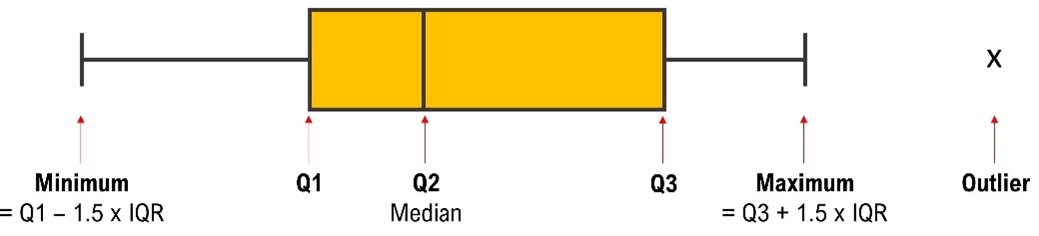
Box & whisker plots (also called five-number summary plots) show the minimum, first quartile, median, third quartile and maximum values of a data set.
Box-and-whisker plots show the minimum, first quartile, median, third quartile and maximum values of a data set.
The upper and lower fences (minimum and maximum) are 1.5 times the interquartile range (see Measures of Variability) from the upper and lower quartiles, respectively.
Outliers in your Data are values which are lower than the lower fence or higher than the upper fence. This is shown in the graph below.
We recommend producing box-and-whisker plots using an online plot maker such as HERE.
You are studying fish in a particular location. You have recorded the following measurements (cm) for the length of 30 fish:
14.7 14.1 21.3 16.4 15.8 12.7 6.0 13.8 14.2 13.0 11.6 13.7 17.3 13.3 12.4
11.5 13.2 21.5 26.4 16.5 14.3 15.7 12.5 19.8 17.9 16.3 29.3 21.8 14.4 12.5
Present this data using a box-and-whisker plot.
We will use the online plot generator HERE.
Enter the data into the plot generator. NOTE you must separate each value with a comma and have no spaces between numbers. Now match up the following values?
Upper limit test for outliers = | 4.3 |
Lower limit test for outliers = | 23.75 |
Number of outliers = | 14.35 |
Interquartile range (IQR) = | 6.55 |
Median = | 13 |
Lower quartile (Q1) = | 17.3 |
Upper quartile (Q3) = | 3 |
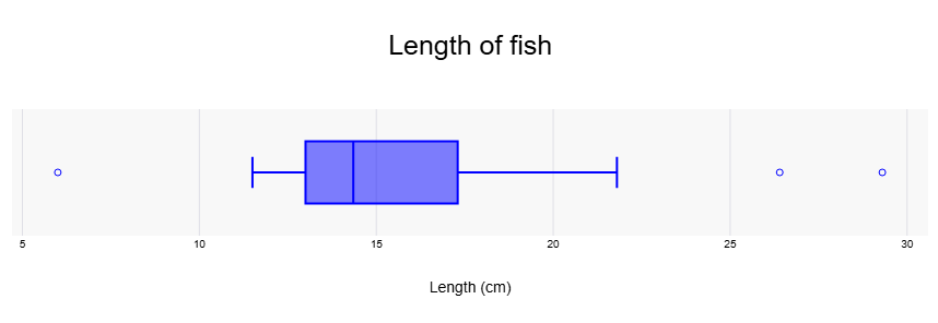
You should have a graph similar to that on the one shown below.
The IQR is calculated as Q3 - Q1.
The lower limit test for outliers
= Q1 - 1.5 x IQR
= 12.925 - 1.5 x 4.525
= 6.1375
The upper limit test for outliers
= Q3 + 1.5 x IQR
= 17.45 + 1.5 x 4.525
= 24.2375
Thus, the data point of 6 is below the lower limit and the data points of 26.4 and 29.3 are above 24.2375. Therefore these points can be considered outliers and are shown as dots on the graph.
NOTE: In reporting these figures you should be consistent with your number of decimal places, and the number of decimal places should make sense (for example, the number of individuals in a population must be a whole number).